Kill the Rotating Banner… If You Want New Customers
Few website features are as popular as rotating banners. And few are so effective at killing your online lead generation.
Rotating banners are also known as “image carousels” or “sliders”. They allow you to show multiple banner messages to your website visitors by presenting them one at a time. They usually rotate automatically at fixed time intervals. Sometimes a visitor can control the rotation with banner navigation.
Rotating banners are popular because they allow you to reduce clutter and make every banner large and beautiful.
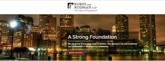
Here’s an attractive example of a Boston law firm with a rotating banner.
So what’s the problem?
The Obvious Problems
Much has been written about the many negatives of rotating banners, so I won’t bother. I’ll just list the common complaints:
- The motion distracts your visitors from more important page elements.
- Few visitors will read all your banner slides — we don’t have the patience.
- Some visitors can’t read your banners even if they want to — they rotate too quickly.
- Most web users have banner blindness and will look elsewhere on the page for info.
- They often don’t work well responsively (across all device sizes and browsers).
- They pose accessibility issues for those using screen readers or slow with a mouse.
- They hurt your SEO by increasing page load times and muddling your headers.
- They take away control from visitors, and visitors want to be in control.
Need some numbers on this? Rotating banner slides get clicked less than 1% of the time. And when they do get clicked, the first slide gets 90% of the clicks. In other words, most of your rotating slides are simply ignored.
Still not sure you believe it yet? A quick visit to ShouldIUseACarousel.com should do the trick.

The Not-So-Obvious Problem
But I want to focus on one big negative of rotating banners that is usually overlooked.
If you need your website to generate online leads for you, then this is the most important problem.
Rotating banners let you be lazy with your marketing.
One reason rotating banners are popular is because they allow you to toss in all your ideas “without creating clutter”. Or, in a larger company, they allow every VP to get his or her idea proudly displayed on the company home page.
In other words, a rotating banner is the product of a lack of marketing focus.
If you want to generate good leads online, then your biggest challenge is to clearly convey your Unique Selling Proposition (USP).
Your USP says who you are and what you offer the world. It clarifies what you do, who you do it for and how your business is unique. It tells a good prospect that they can stop looking now.
[We recently published a podcast episode all about the USP, complete with a step-by-step process for crafting your USP.]
Your USP needs to feature in some form on all your website pages. On your most important website pages it needs to be the singular idea, front and center, clear and strong.
A rotating banner is the antithesis of clear USP presentation.
A rotating banner takes 3 or 5 or 7 (or more!) messages & images and presents them in a way that gives them all equal weight. It demonstrates that you don’t know what’s most special or different about your business. And guess what? Your visitors aren’t going to know either!
The biggest problem with the rotating banner is that it distracts from or altogether hides your USP. For small businesses trying to engage good prospects online, that’s fatal.
Need help creating your USP?
>>> Download our free report and craft a powerful USP today
OK, So If I Kill My Rotating Banner, What Do I Do with All That Empty Space?
Here’s what you do instead:
- Lead with your USP
- Support your USP with compelling images and high-quality content
- Help visitors quickly figure out where to go next with clear navigation
- Offer a single, high-value enticing CTA (call to action)
Your goal is to give your visitors reason to take your desired lead generation action. This focused approach will do that. Rotating banners will not.
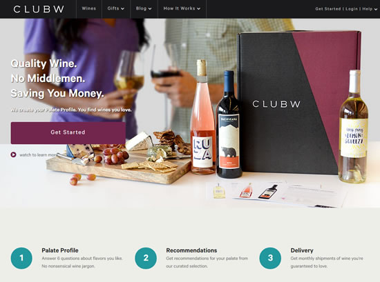
Here’s a well-done example from Club W. No movement. Just a clearly presented USP with well-integrated visuals and a CTA. (Those wine clubs get me every time!)
And here are some other creative ways to design a webpage without a rotating banner. Of these, my recommendation, no surprise, is to “Highlight Your Value Proposition”.
But Surely a Rotating Banner is Good Sometimes?
Hey, I’m not an extremist. I can see the other side. Is there ever a good time for a rotating banner? Yes indeed.
Are you a big, established company? Does anyone who would ever buy from you already know who you are and what you do? If so, then the purpose of your business website may simply be brand promotion. In that case, two things. First, congratulations – we’re all jealous. Second, a rotating banner can effectively convey feelings of “our company does a lot of great, important things”. That can help your branding. Just don’t expect to ever gain a single new cold lead.
Or, has your boss ordered you to add some horribly awful new content to your precious website? You can happily drop the content into a rotating banner and then rest easy knowing that visitors will simply ignore it. It’s a win-win.
But if you need your website to generate leads for your business, kill the rotating banner!

Andrew, I was wondering your opinion about location/destination websites using rotating banners. I’m selling the dream of living in a beautiful, exciting city and using large, colorful images to convey the message that we are renting great houses and promoting a lifestyle renters want. Photos create emotion and desire but I know words (a USP) are required too. Do you feel a rotating banner is a bad idea in this situation? Thanks for the thought-provoking content; it definitely made me stop and reconsider my position on rotating banners.
Hi David — In this case, here’s what I’d highly recommend. Use a rotating banner to show the variety of fantastic images that you have, BUT… don’t change the text. Keep your message the same on each slide (both the text and its position). In this way you get to convey the emotion and desire you want while keeping your USP crystal clear. If you try this, please post a link here later so we can see how it looks.
Great blog! I’ve always been partial to carousel images sliders…but you’ve given me some ‘food-for-thought’ with the great points you’ve made about them on their DISadvantages 🙂 …it’s a pain-in-the-a** when I get obsessive with creating a user-friendly experience for visitors too Haha! so i won’t get so frustrated in future now that i’ve read this – so thanks!